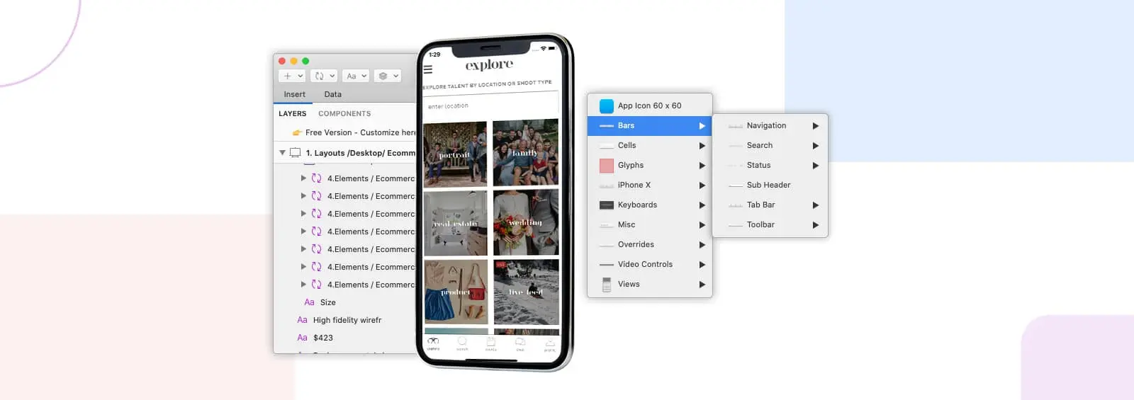
Onboarding Flows:
There is a popular user experience quote “A user interface is like a joke. If you have to explain it” While clever, that statement is far from true. Onboarding flow must provide the right direction to new users on how to use the app. It has to be short and precise at about 3-5 screens in conveying the core benefit/functions of your app. Each screen can describe the functionality using the relevant screenshot for the user to relate to the functionality. Additionally, have an easy to access “skip intro” or “Login/Signup” option for the existing users if someone is in a hurry to get started with Login/Signup.
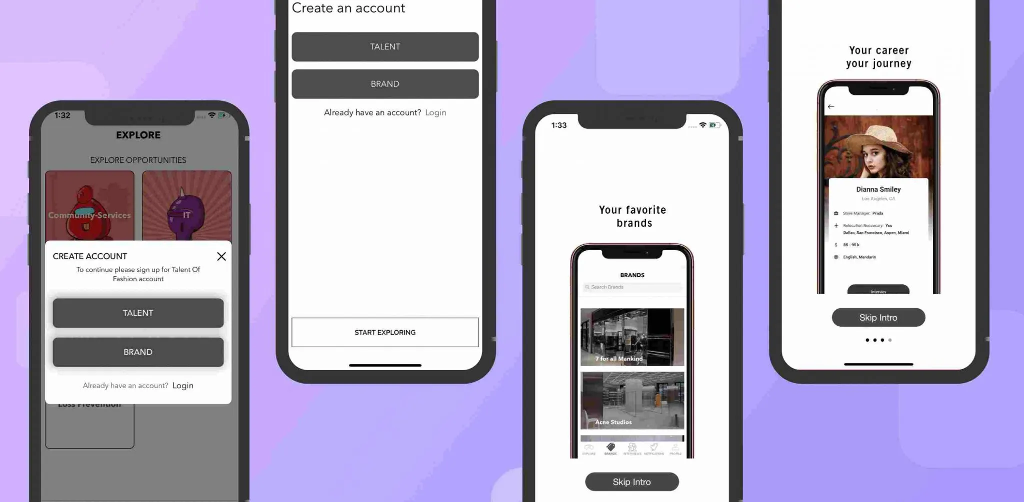
Login/Registration Flow:
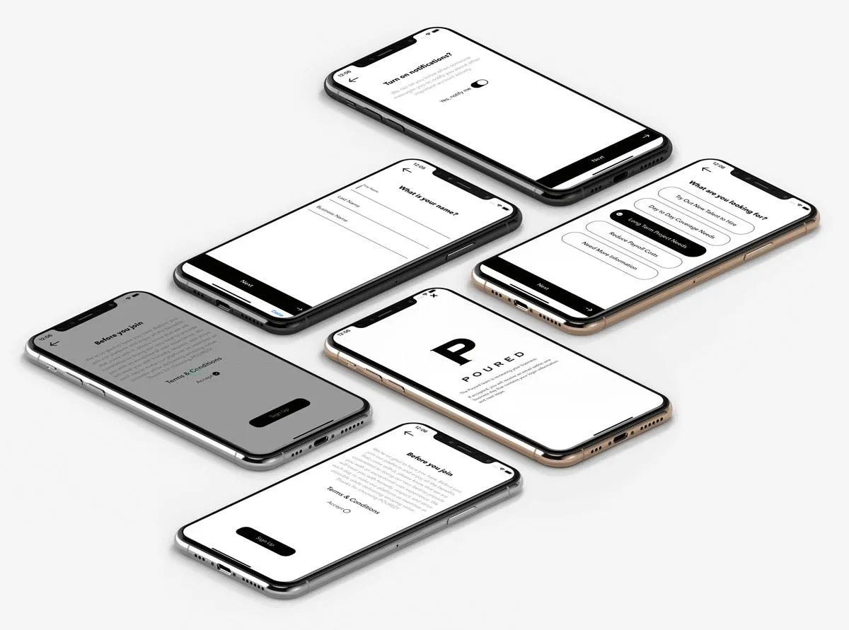
Login/Registration flow is an important step to capture user information. Having a seamless flow with minimum steps to access the core functionality of the mobile app stands out and has a lot to impact on user retention. The design needs to ensure that the information captured during signup is absolutely needed for the app and the same is conveyed to the user so that they feel more confident. Few things that can make users love the flow:
- Way to let the user get started with the app is having an explore option to access the app without signup/login and asked to authenticate only when it is needed.
- Allowing users to authenticate directly on signup instead of waiting for an email confirmation and then letting them log in again.
- Having social logins to authenticate quickly without too much hassle of entering email and password.
Maps:
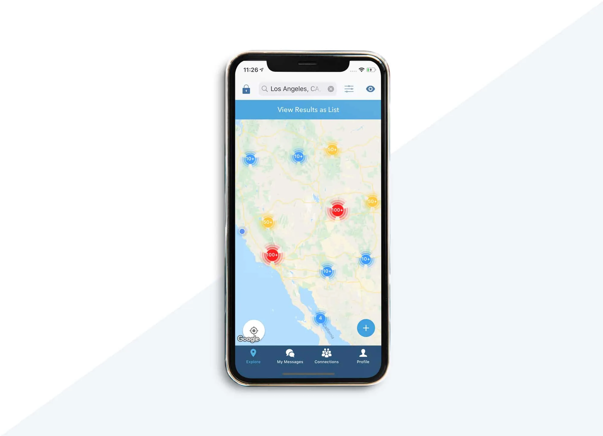
Maps are an integral part of the app that deals with geo-location.
- Showing the location of the interest
- Finding out the directions
- Locating the store
- Locating the communities to events around you
Selecting Address:
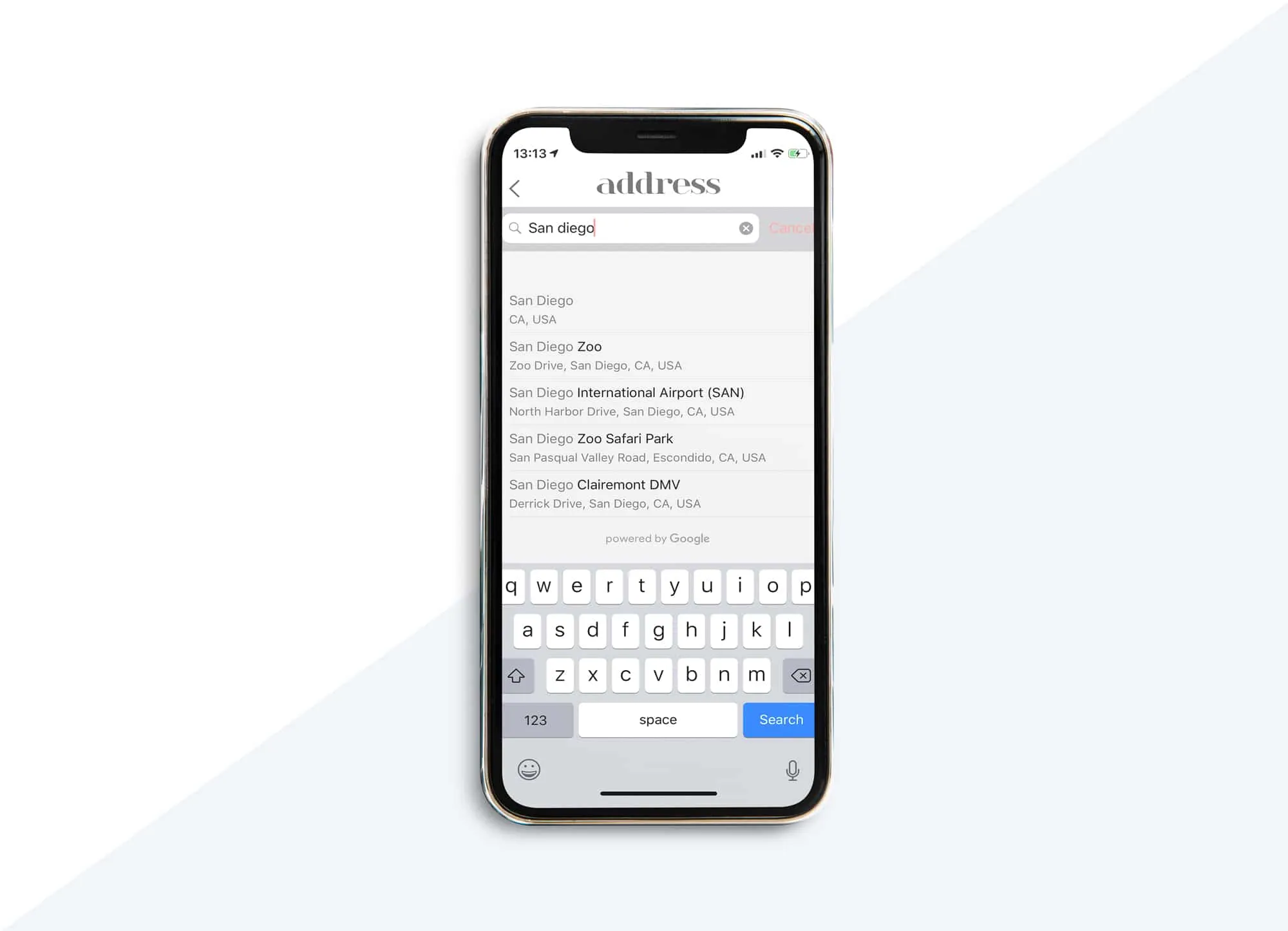
Selecting addresses no more have to be a free input field, validating addresses is no more a headache. Google places come to the rescue, it helps to solve problems locating an address. It provides:
- Auto-suggest the addresses based on the geolocation.
- Allows the user to search for an address.
Booking Flow:
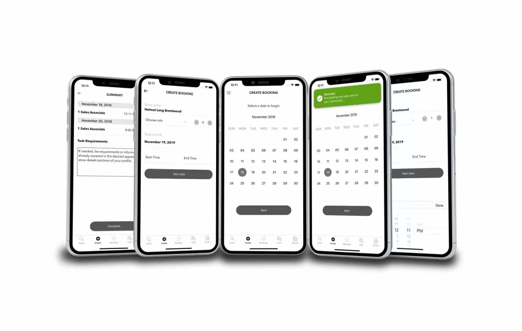
Booking flow needs to capture the right amount of information and at the same time conveying user about the necessity of the collected information, It could be done in steps to collect the needed information and summarize all the information as the last step to confirm before going ahead and creating the booking. Presenting the user with precise data helps in making the decision quickly and for that having the basic/advanced filters makes a good choice.
Eg: If you are booking a service provider – allowing a user to select the service, providing an option to add location, booking date, duration, list of providers to select from. Enabling filters on provider based on rating, availability.
Calendar:
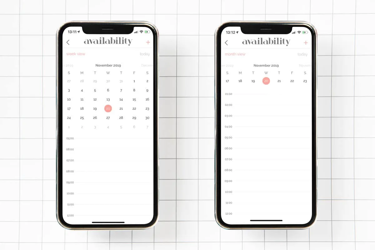
Can be helpful in scenarios like:
- Selecting a date or a date range
- Showing availability/unavailability
- Blocking dates for availability/unavailability
Chat:
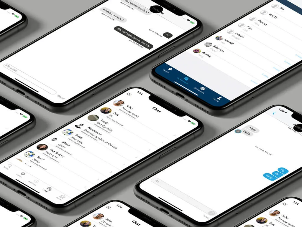
Chat needs to have two steps,
- Channels – showing all the conversations
- Showing chat for a specific conversation
Bottom navigation bars allow movement between primary destinations in an app. Tapping on a bottom navigation icon takes you directly to the associated view or refreshes the currently active view.
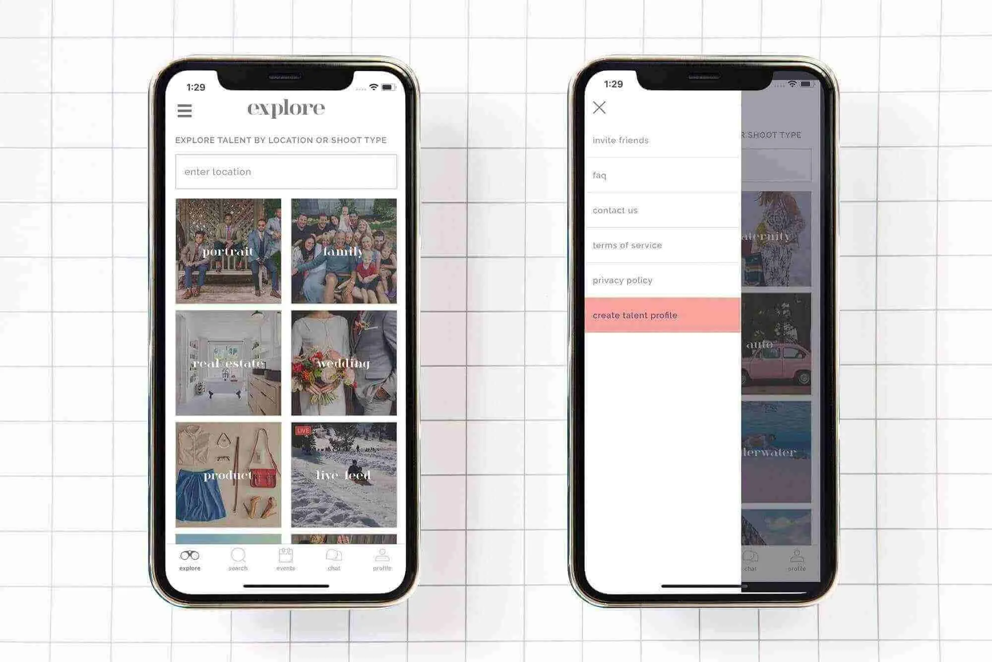
Side out design lets you navigate within your app, without covering any space on the screen, It slides out on tapping of the button icon on the top right/left of the navigation bar, once it is expanded, it can be easily be closed just by swiping left on the content area.
Profile:
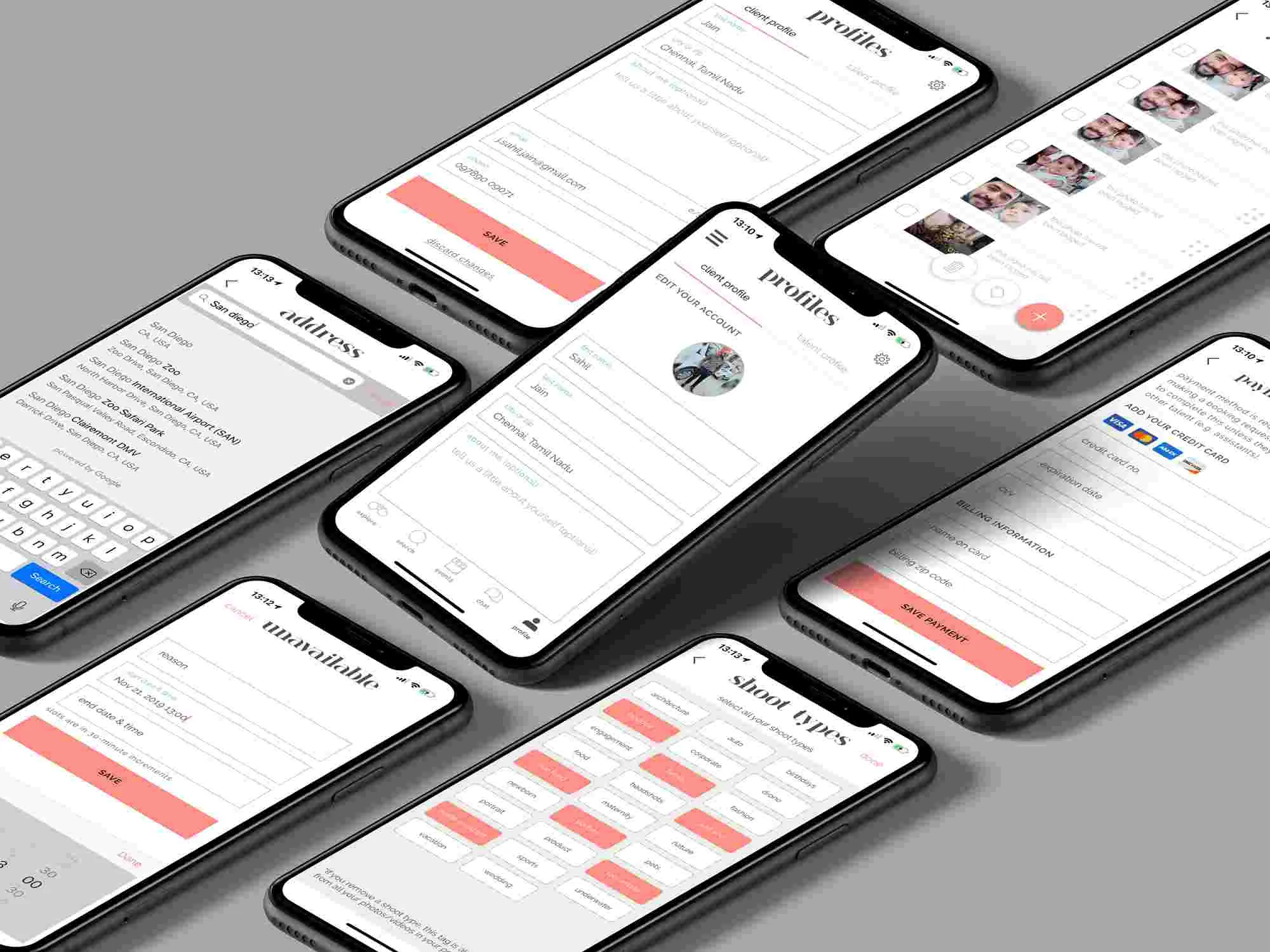
Profile Info view provides a way for the user to verify and update their personal information that they have added throughout the app.
Connections:
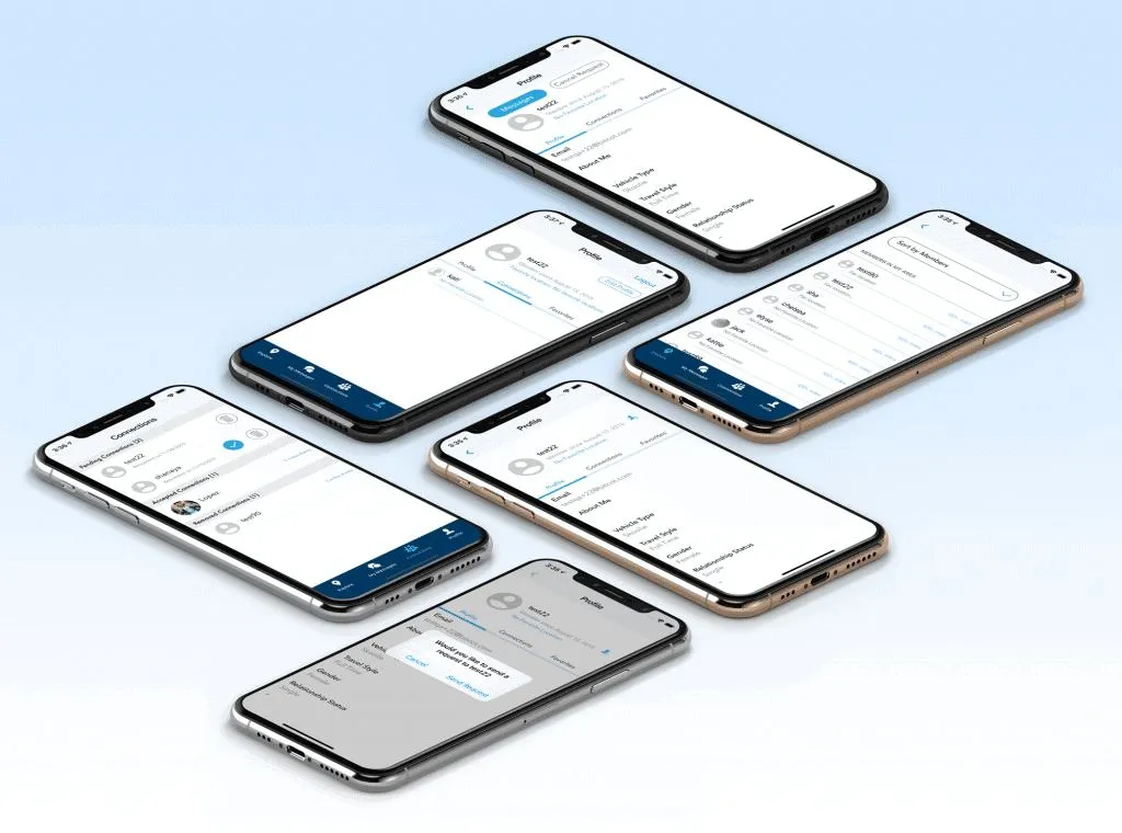
Connections are the way to connect with the people you want to know more about, by inviting people to connect with you and allowing connections to establish once the recipient has accepted the connection request, this flow ensures people connect only if both the sender and the receiver has acknowledged.
Payment:
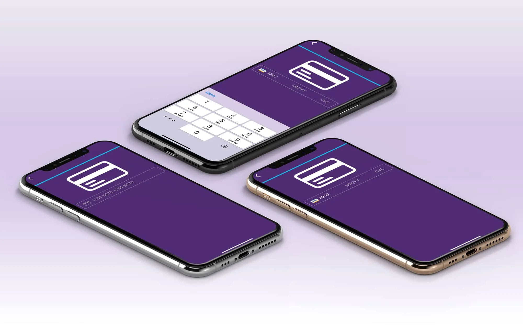
Payment flows are an integral part of every app if you plan to monetize your app in return for the service provided. Having a simple user experience to make the payment adds a lot of value to your app.
Video Player:
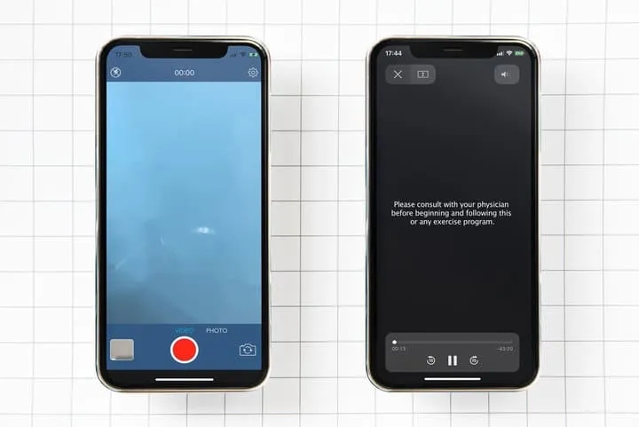
Video content provides an engaging and insightful experience to the end-users of the app. All the apps that plan to play/record a video, iOS provides a powerful MediaPlayer framework that allows us to play a video stored locally on your device or from a remote location. In the case of advanced features such as media editing, track management, and others, iOS provide AVFoundation framework.
Settings:
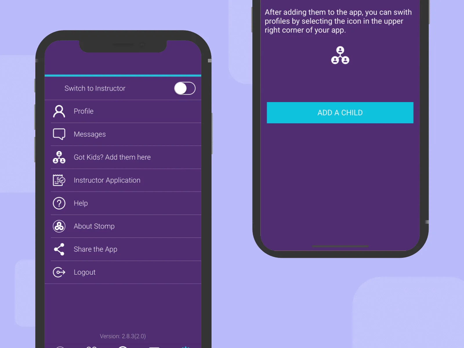
It provides access to all the miscellaneous options like Notification settings, TOS, Privacy, FAQ, Contacts us, Logout, Support, etc.
- Add all the infrequently changed configuration options in settings.
- Providing quick access to settings when appropriate.
- Providing device, app, env versions in the settings for user reference.
Good or bad, we’d love to hear your thoughts. Find us on Twitter (@Bitcot) or write into – [email protected]
If you like this curation, read more related articles:

