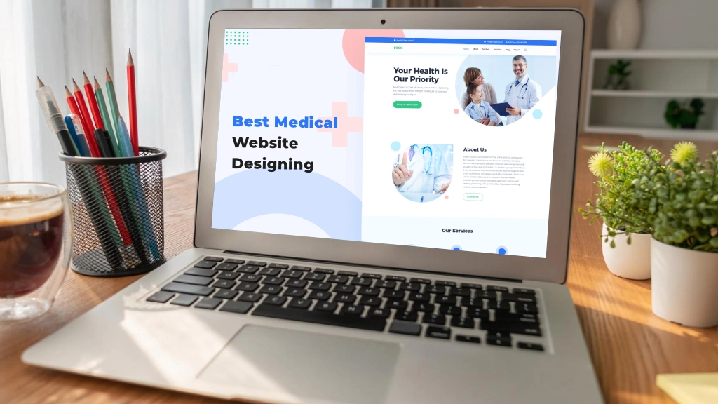
Having a well-designed website is imperative for any medical practice or healthcare organization in the digital age we live in today. Medical web design is essential to healthcare marketing in today’s digital age. A well-designed medical website can help healthcare professionals connect with patients, provide valuable information, and showcase their services.
However, designing a medical website can be challenging, as it needs to balance the need for a professional appearance with the need for user-friendly functionality. In this article, we’ll showcase 30 of the best medical web design examples from USA websites to help inspire your next healthcare website design.
These websites look visually stunning and offer a user-friendly experience, making it easier for patients to find the information they need. Whether you’re looking for inspiration for your medical website design or want to appreciate some beautiful one, read on to discover some of the best medical website designs.
Best Medical Website Design [Ideas, Inspirations & Examples]
You’ve come to the right place if you’re seeking ideas and inspiration to create the best medical web design. Whether you’re a small clinic, a specialized medical practice, or a large hospital, this blog post will equip you with the knowledge and inspiration you need to create a medical website that not only captures your unique identity but also serves as a powerful tool for patient acquisition, education, and engagement.
So, let’s dive into the world of medical website design and discover the best practices, innovative ideas, and inspiring examples that can transform your online presence and drive your healthcare organization toward success.
1. Mayo Clinic

Mayo Clinic’s website is a great example of medical web design that is visually stunning and highly functional. The website’s clean, modern layout makes it easy for visitors to find the necessary information. At the same time, the use of high-quality images and videos adds an engaging visual element to the site. The website also features a comprehensive health library where patients can find information on various medical conditions and treatments.
2. Cleveland Clinic
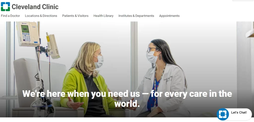
Cleveland Clinic’s website is another example of medical web design done right. The website’s minimalist design and bold typography create a sleek, modern look that is both professional and welcoming. The homepage features a prominent search bar and easy-to-navigate menus that allow patients to find the information they need quickly. The website also features a patient portal to access their medical records, schedule appointments, and communicate with their healthcare team.
3. WebMD
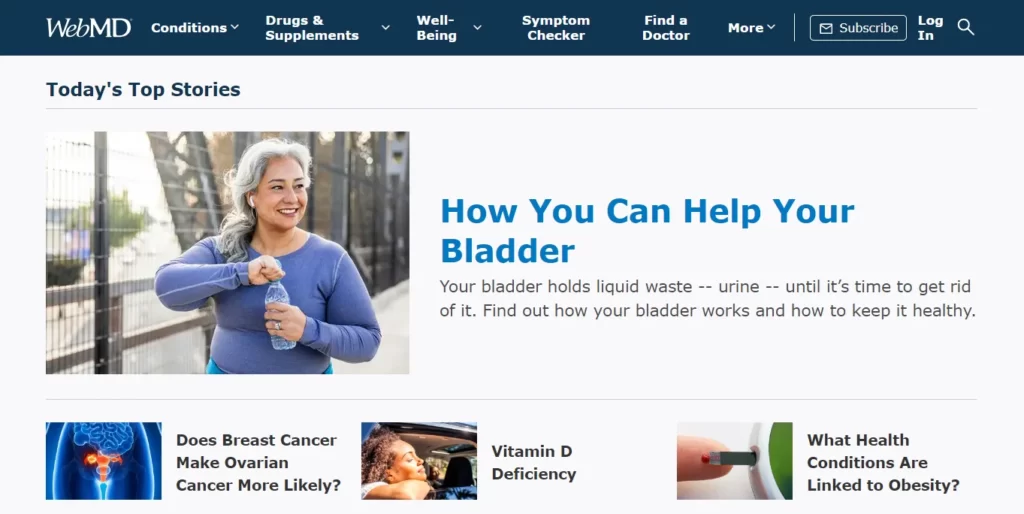
WebMD’s website is a comprehensive resource for health information, and its web design reflects that. The site’s use of clear, concise language and easy-to-read typography makes it easy for visitors to find the information they need. In contrast, the use of high-quality images and videos adds visual interest.
4. UC San Diego Health
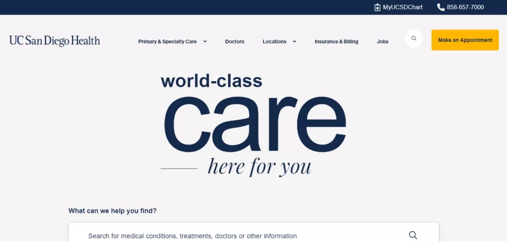
UC San Diego Health’s website features a clean, bright design emphasizing the hospital’s commitment to exceptional patient care. The site includes detailed health resources and information, as well as easy-to-use tools for scheduling appointments and managing health information.
5. Johns Hopkins Medicine
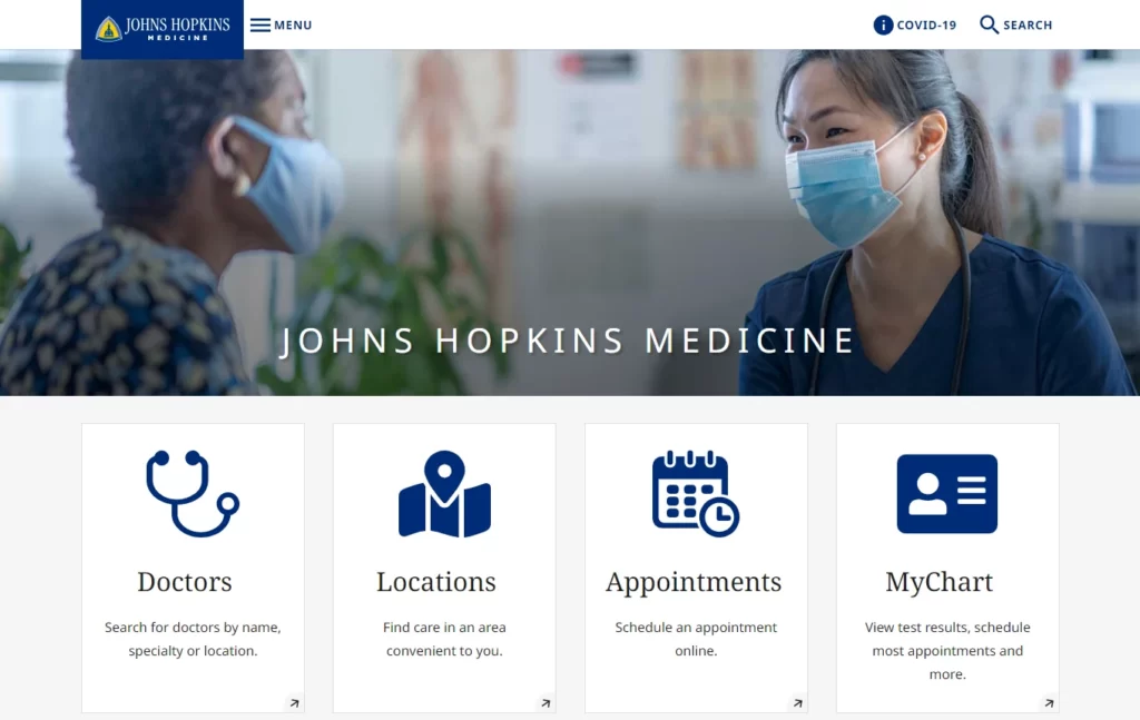
Johns Hopkins Medicine’s website features a modern, responsive design that looks great on any device. The homepage features a prominent search bar and easy-to-navigate menus that allow patients to find the information they need quickly. The website also features a patient portal to access their medical records and communicate with their healthcare team.
6. University of California, San Francisco Medical Center
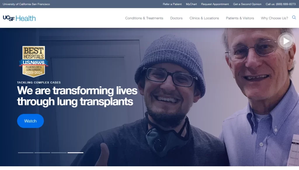
The University of California, San Francisco Medical Center’s Website features a clean, modern design, with easy-to-navigate menus that allow patients to quickly find the information they need. The website also features a patient portal to access their medical records and communicate with their healthcare team. One unique feature of the website is the “MyChart” feature, which allows patients to schedule appointments, refill prescriptions, and communicate with their healthcare team in one place.
7. HealthTap
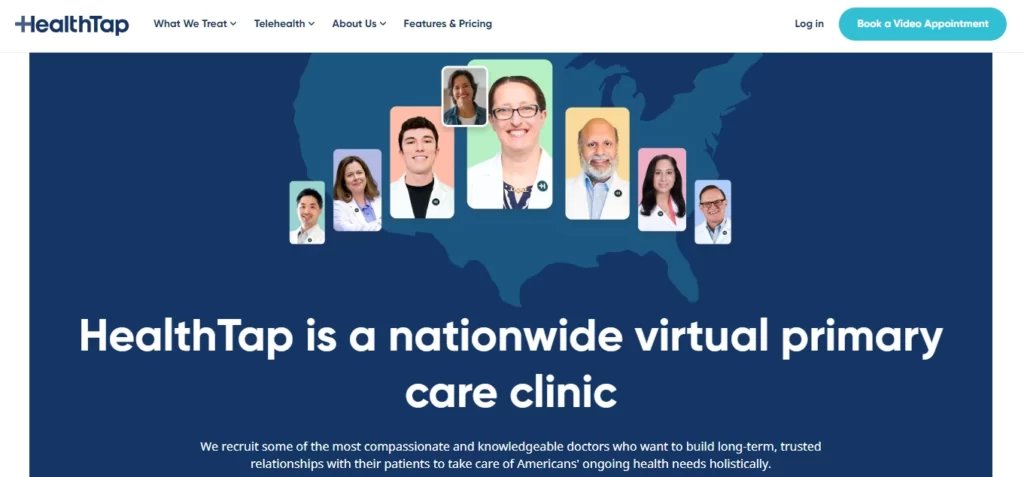
HealthTap’s web design is modern and user-centric, featuring a clean layout and intuitive navigation. The platform provides an interactive experience, allowing users to access expert medical advice through virtual consultations and Q&A sessions. With its responsive design, HealthTap ensures seamless accessibility on both desktop and mobile devices, making it a convenient and reliable healthcare resource for users worldwide.
8. Children’s National Hospital
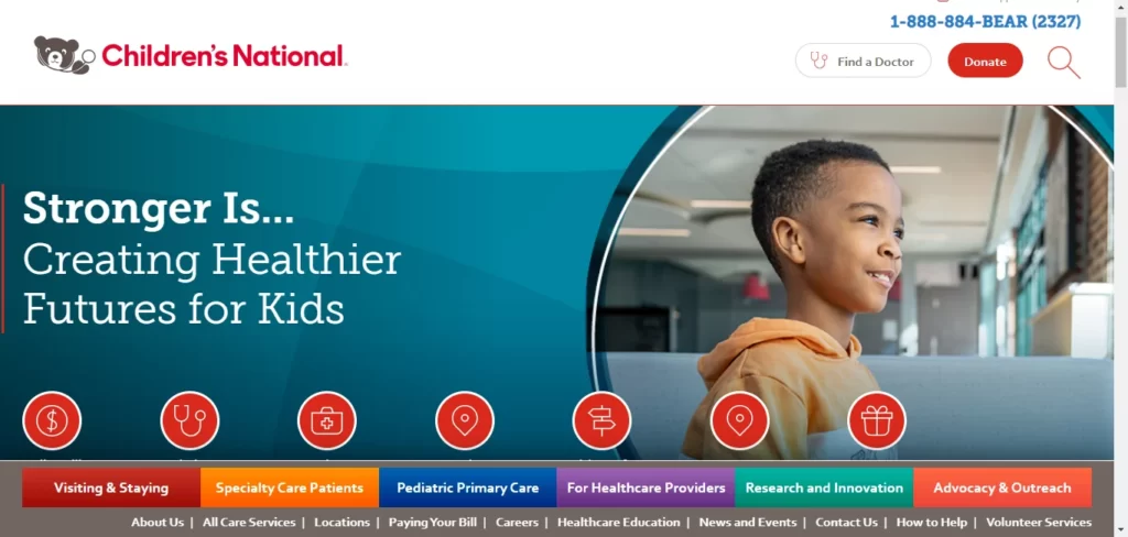
Children’s National Hospital’s website features a colorful, engaging design that appeals to children and adults. The homepage features easy-to-navigate menus allowing patients to find the information they need quickly. The website also features a patient portal where parents can access their child’s medical records and communicate with their child’s healthcare team.
9. American Medical Association
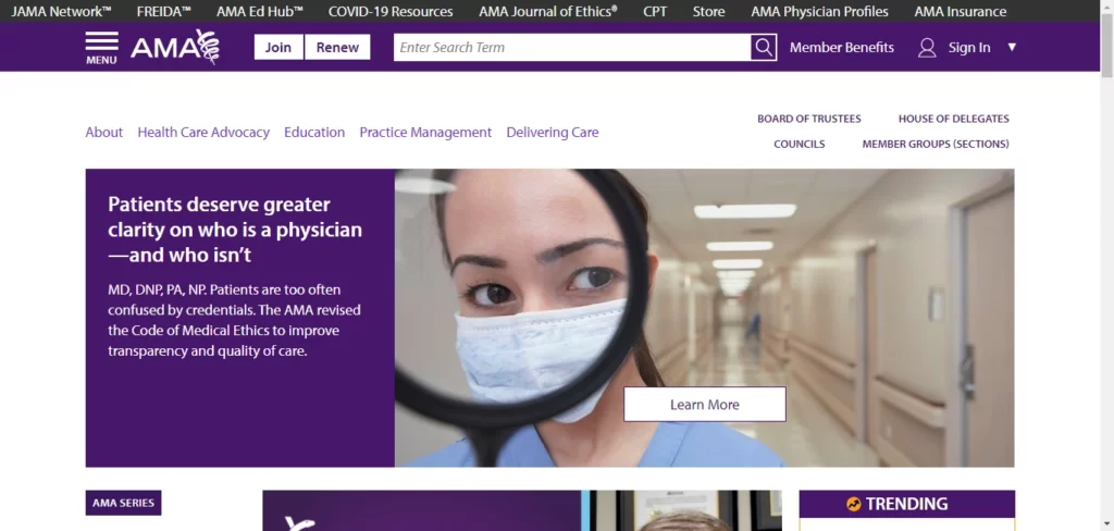
The American Medical Association (AMA) website showcases a professional and organized web design. Its easy-to-navigate menus lead users to valuable resources, such as medical education materials, advocacy information, and practice tools. The site’s responsive layout ensures accessibility on various devices. With its visually engaging design and user-centric approach, AMA’s website remains a trusted destination for medical professionals and the general public.
10. Beth Israel Deaconess Medical Center
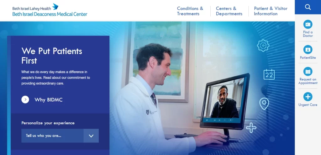
The website of Beth Israel Deaconess Medical Center boasts a sleek and contemporary design, complete with intuitive menus that make it effortless for patients to access necessary information with ease. The website also includes a patient portal that provides patients access to their medical records and enables communication with their healthcare providers. A standout feature of the website is its “Find A Doctor” tool, which allows patients to search for physicians by name, speciality, or location.
11. Cedars-Sinai
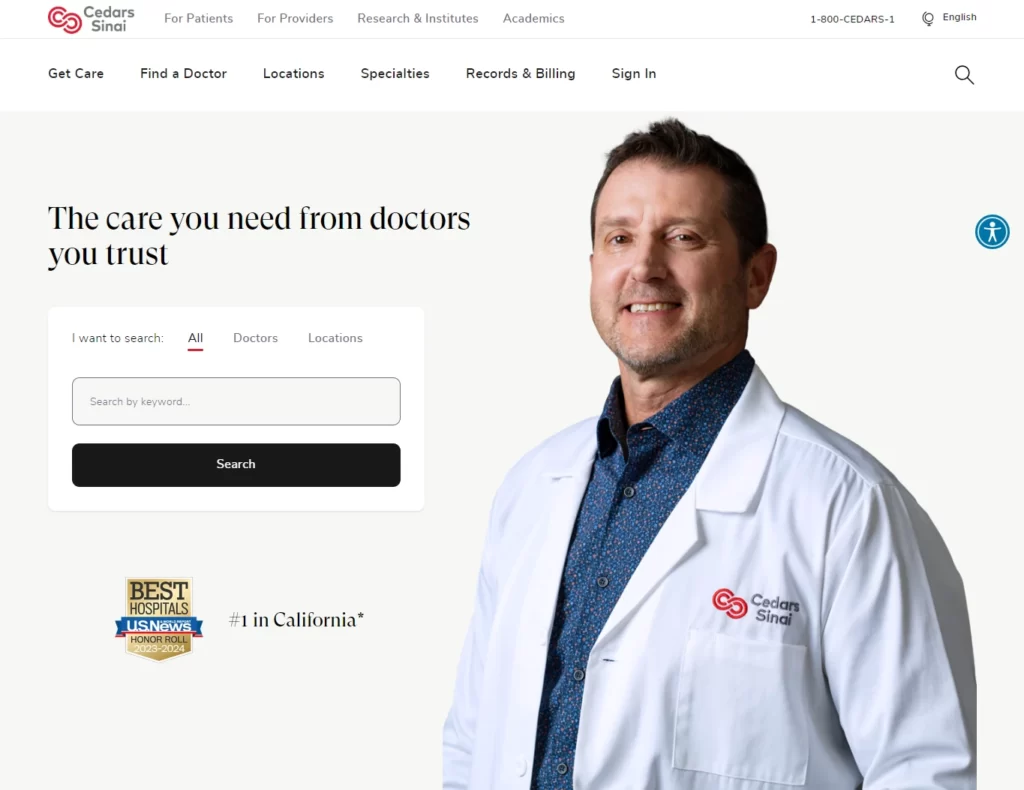
Cedars-Sinai’s website features a clean, modern design that emphasizes the hospital’s expertise and commitment to personalized care. The site includes detailed information about health services and conditions and an easy-to-use patient portal for scheduling appointments and managing health information.
12. National Institutes of Health
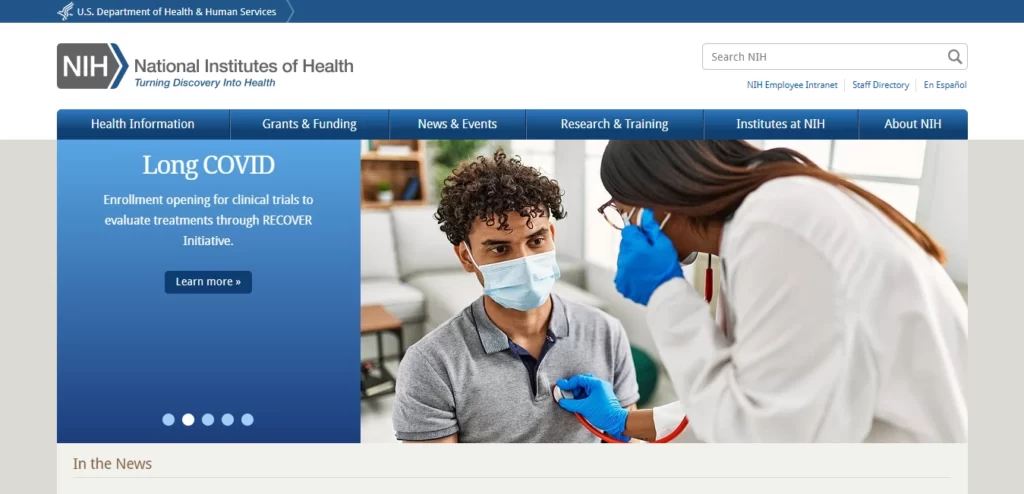
The National Institutes of Health (NIH) website boasts a comprehensive and user-friendly web design. Its organized layout and clear navigation allow users to explore a vast repository of health-related information, research, and clinical trials. The site’s responsive design ensures optimal accessibility across devices. With interactive tools, health topics, and multimedia resources, NIH remains a reliable source for evidence-based healthcare knowledge.
13. Advocate Health Care
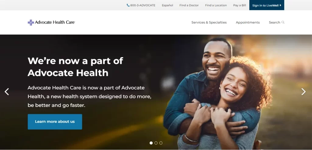
Advocate Health Care’s website features a clean and modern design with a prominent search bar and clear navigation links to different sections of the site. The patient portal allows patients to access their medical records and communicate with their healthcare team. Responsive design ensures accessibility on different devices, and high-quality content provides informative information on medical conditions, treatments, and procedures.
14. HealthCare.gov
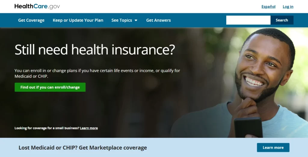
HealthCare.gov’s website design features a user-friendly interface for easy access to healthcare information and enrollment options. The site’s clear navigation guides visitors through health plans, coverage details, and subsidy eligibility. Its responsive design ensures optimal viewing on various devices. With interactive tools and multilingual support, HealthCare.gov offers a seamless and inclusive healthcare resource for users seeking insurance coverage.
15. American Heart Association
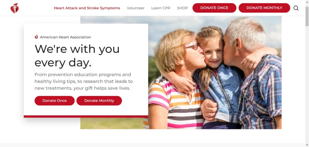
The American Heart Association (AHA) website showcases a user-friendly web design, offering essential resources for heart health. Its clear navigation and organized content enable visitors to easily access information on healthy living, CPR training, and heart conditions. The responsive design ensures optimal user experience on various devices. AHA’s web design exemplifies its commitment to promoting heart health and saving lives.
16. Centers for Disease Control and Prevention
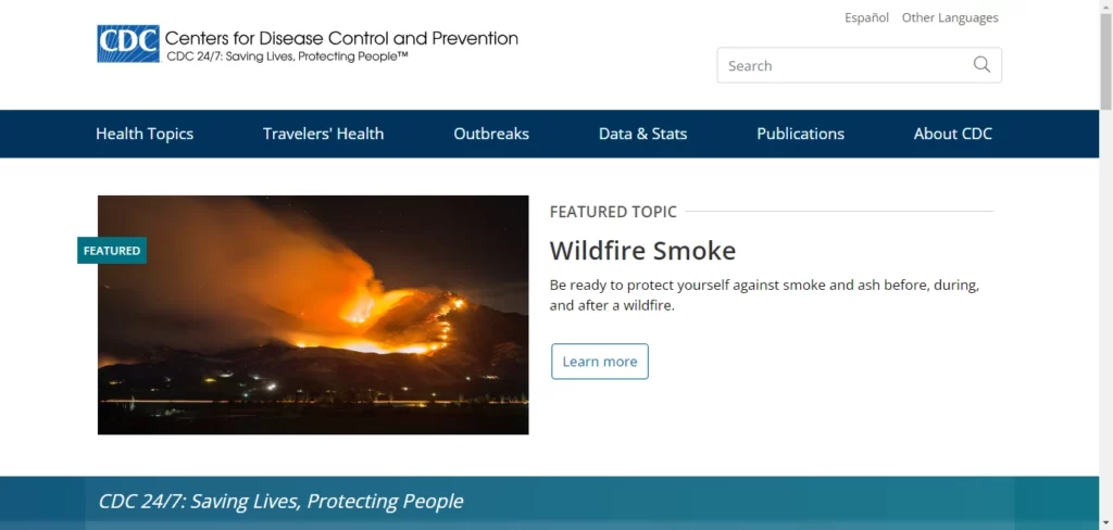
The Centers for Disease Control and Prevention’s website has a simple and intuitive design with a clear navigation menu. High-quality content provides up-to-date information on diseases, outbreaks, and health concerns. The website also features a section on emergency preparedness and response. Social media integration allows visitors to connect with the CDC on different platforms to stay informed. These features make the CDC’s website an excellent example of a well-designed medical website.
17. Atrium Health Wake Forest Baptist
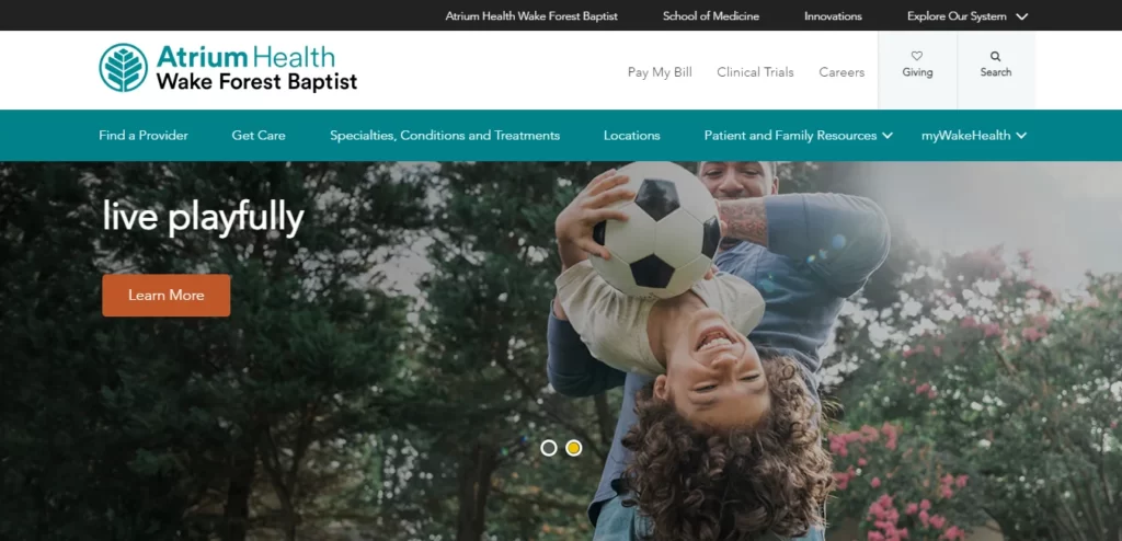
Atrium Health Wake Forest Baptist’s website features a clean, modern design that emphasizes the hospital’s commitment to excellence in healthcare. The site includes detailed information about health services and conditions and an easy-to-use patient portal for managing appointments and health information.
18. Vanderbilt Health
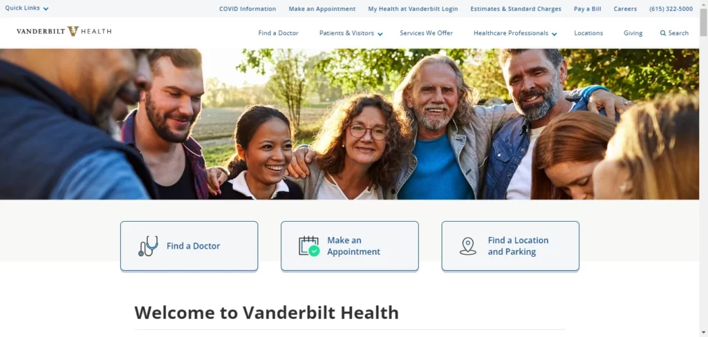
Vanderbilt Health’s website features a modern and intuitive web design, offering easy navigation to medical services, specialties, and patient resources. Its responsive layout ensures seamless access on various devices. The site provides informative content, appointment booking functionality, and a patient portal for personalized healthcare management. Vanderbilt Health’s web design prioritizes patient-centricity and enhances the overall healthcare experience.
19. Scripps Health
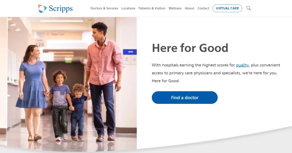
Scripps Health’s website features a bright, friendly design emphasizing the hospital’s expertise and commitment to exceptional care. The site includes detailed health information and resources for patients, as well as easy-to-use tools for scheduling appointments and managing health information.
20. American Cancer Society
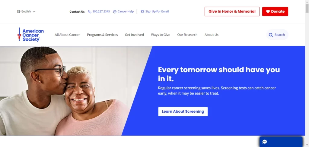
With a user-friendly web design, the website of the American Cancer Society provides a wealth of resources and information related to cancer. The organized layout of the website makes it easy for visitors to access educational content, support programs, and fundraising events. The website’s responsive design ensures an optimal user experience on different devices. By incorporating interactive tools and multimedia resources, the website serves as a valuable hub for cancer patients, caregivers, and supporters.
21. American Diabetes Association
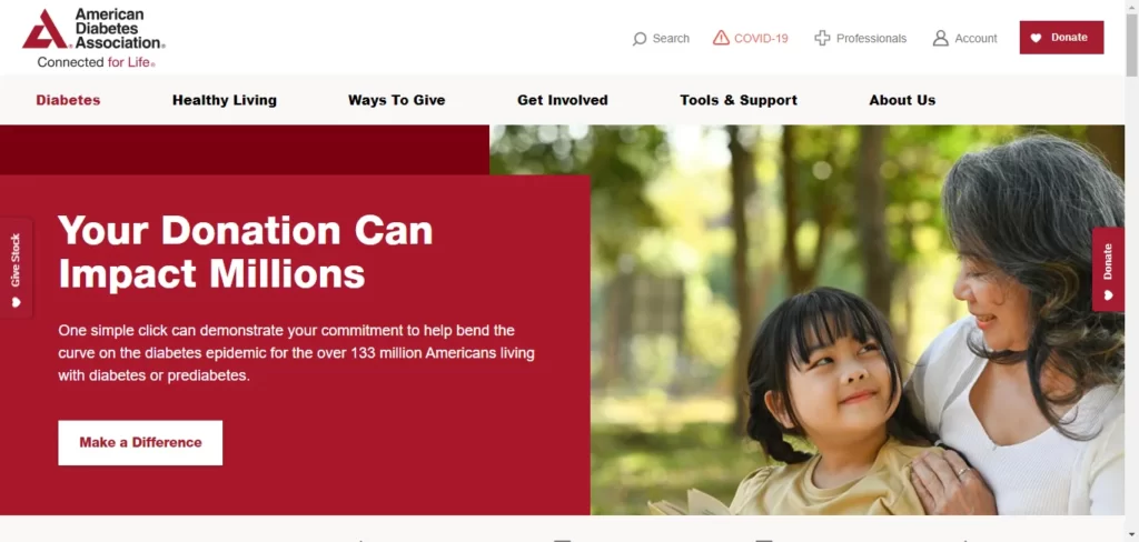
With a user-friendly web design, the website of the American Cancer Society provides a wealth of resources and information related to cancer. The organized layout of the website makes it easy for visitors to access educational content, support programs, and fundraising events. The website’s responsive design ensures an optimal user experience on different devices. The website is a valuable hub for cancer patients, caregivers, and supporters by incorporating interactive tools and multimedia resources.
22. UCLA Health
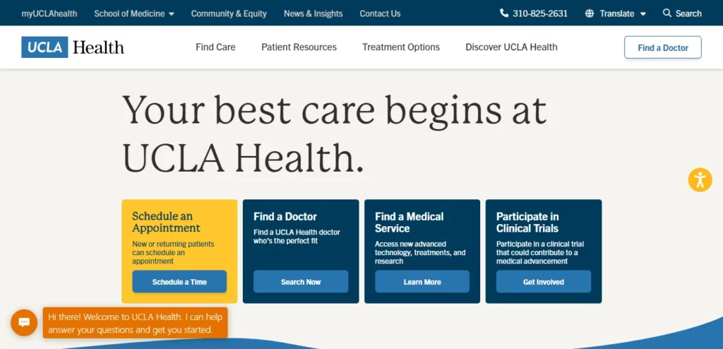
UCLA Health’s website aims to offer patients and families comprehensive healthcare information and resources. The site employs straightforward language and user-friendly navigation, ensuring visitors can effortlessly find the information they seek. Additionally, incorporating high-quality images and engaging videos enhances the website’s visual appeal, making it a valuable and captivating resource for all users.
23. Healthgrades
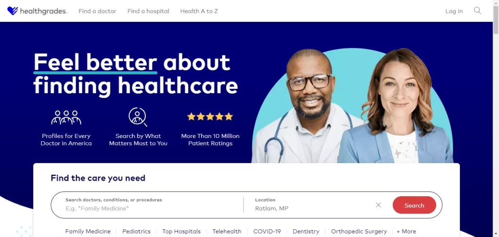
Healthgrades is a website designed to help patients find and compare healthcare providers. The site’s use of clear, concise language and easy-to-use navigation make it easy for visitors to find the information they need, while the use of high-quality images and videos adds visual interest.
24. Best Doctors
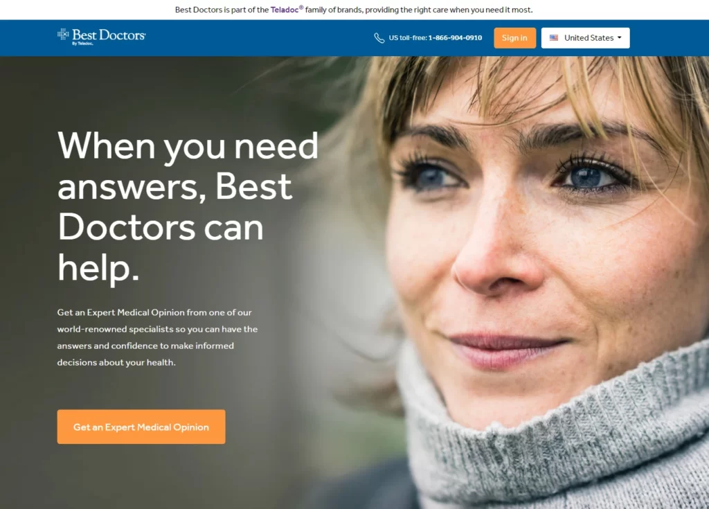
Best Doctors’ website is user-friendly, enabling easy access to top-notch medical resources. The site’s clear layout allows visitors to find the best healthcare providers globally. Its responsive design ensures optimal viewing on various devices. The website offers interactive features like virtual consultations and second opinion services, making it a reliable and convenient healthcare platform.
25. Banner Health
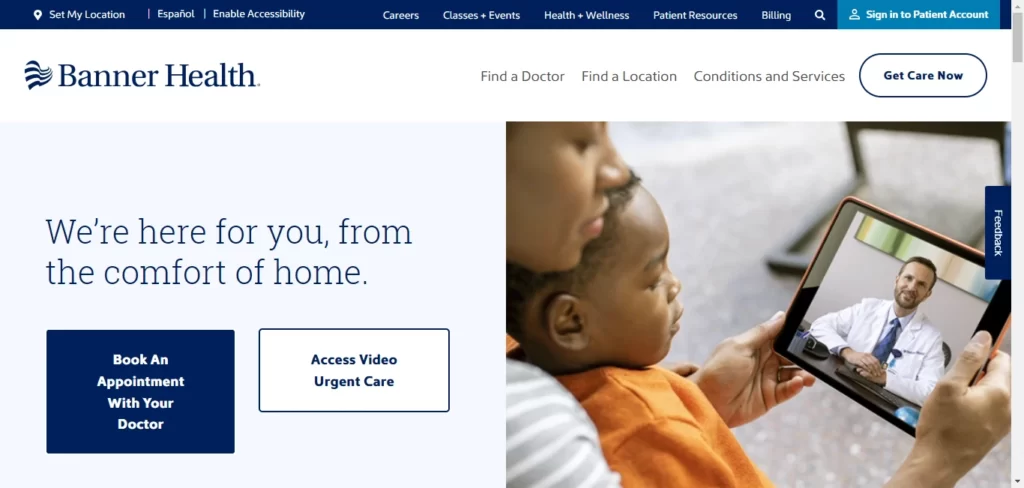
Banner Health’s website features a modern, stylish design emphasizing the hospital’s commitment to exceptional care. The site includes detailed health information and resources for patients and an easy-to-use patient portal for managing health information and communicating with healthcare providers.
26. Aetna
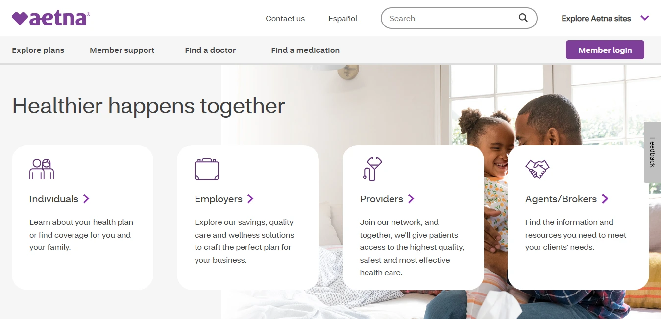
Aetna’s website showcases a user-centric design with easy navigation to insurance plans, provider directories, and health resources. Its responsive layout ensures seamless access on different devices. The site offers interactive tools, like cost estimators and wellness programs, enhancing user engagement. With its visually appealing design and comprehensive information, Aetna’s website is a valuable resource for health insurance and wellness needs.
27. Anthem
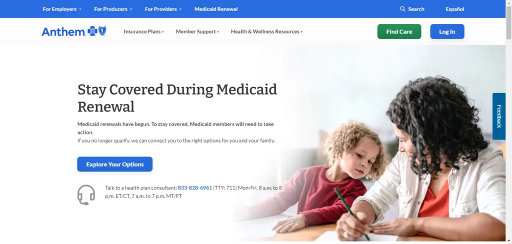
Anthem’s website showcases a modern and user-centric design, offering easy navigation to insurance plans, healthcare services, and member resources. Its responsive layout ensures seamless access on different devices. The site provides interactive tools, such as doctor finders and cost estimators, enhancing the user experience. With visually engaging design and comprehensive content, Anthem’s website serves as a valuable healthcare resource for its members.
28. Yale New Haven Health
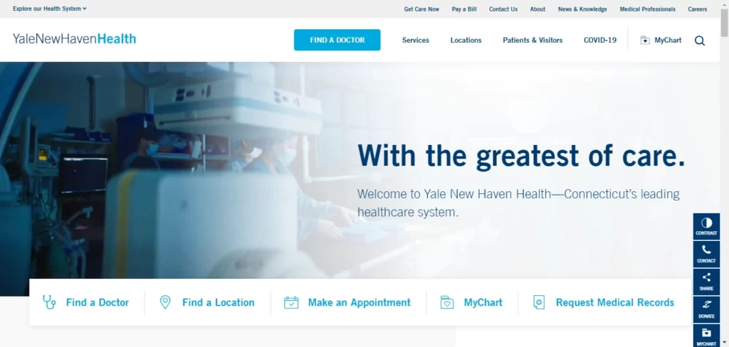
Yale New Haven Health’s website features a user-friendly design, offering easy navigation to medical services, physician directories, and patient resources. Its responsive layout ensures seamless access on various devices. The site provides interactive tools, such as appointment scheduling and virtual visits, enhancing the patient’s healthcare experience. With visually appealing design and informative content, it serves as a trusted healthcare resource.
29. Geisinger Health
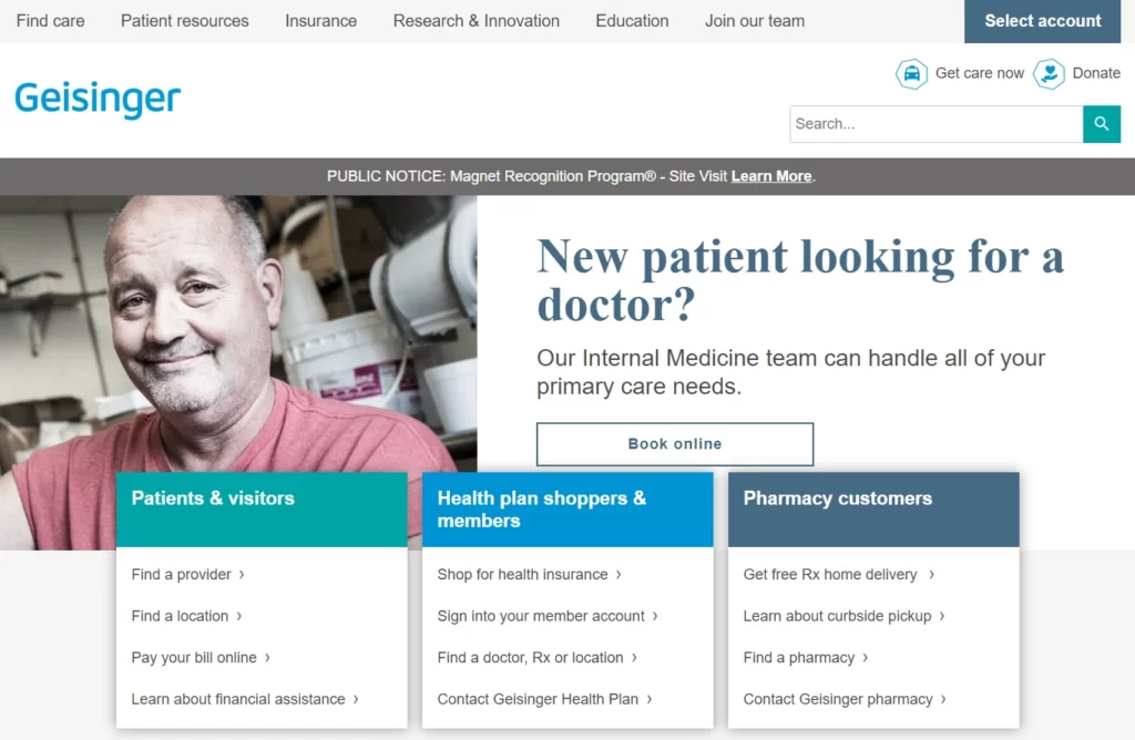
Geisinger Health’s website features a clean, modern design, with easy-to-navigate menus that allow patients to find the information they need quickly. The website also features a patient portal, where patients can access their medical records and communicate with their healthcare team.
30. University of Utah Health
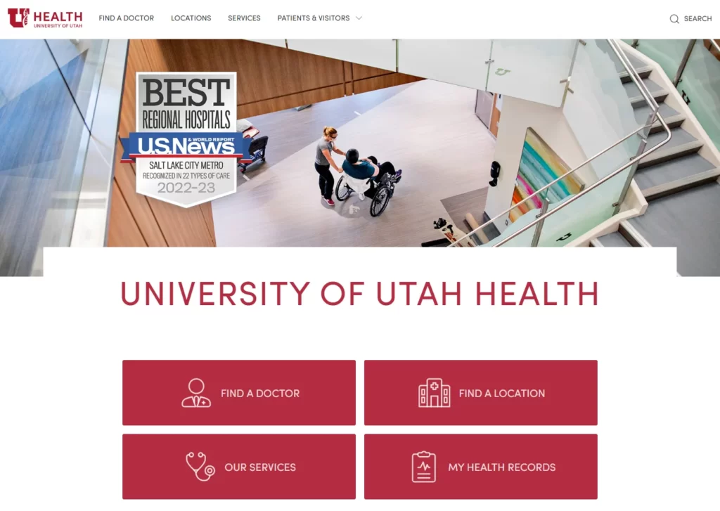
The University of Utah Health’s website showcases a user-centric web design, offering easy navigation to medical services, physician directories, and appointment scheduling. Its responsive layout ensures seamless access on various devices. The site provides interactive tools, such as symptom checkers and patient portals, enhancing the user’s healthcare experience. With visually engaging design and informative content, it remains a trusted resource for patients and healthcare professionals.
31. University of Iowa Hospitals and Clinics
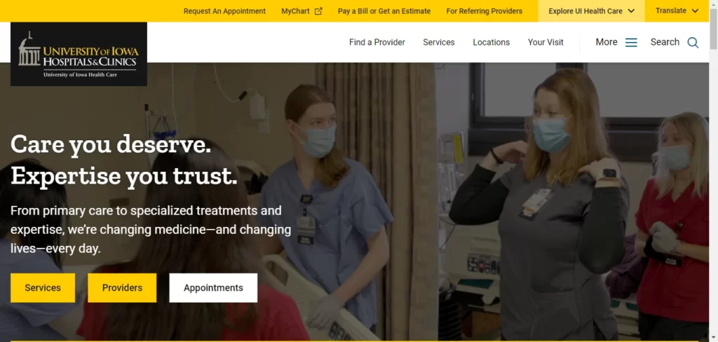
The website of The University of Iowa Hospitals and Clinics showcases a contemporary and clutter-free design, accompanied by user-friendly menus for swift information retrieval by patients. Additionally, the site offers a patient portal, granting individuals access to their medical records and a means to communicate with their healthcare team effectively.
Avoid These Common Mistakes in Medical Website Design
Standing out from the competition with a well-designed website can be challenging, as medical practices commonly make mistakes that hinder their success. Below are some common mistakes to avoid when designing a medical website.
Cluttered Layout
A cluttered website layout is one of the most significant mistakes medical practices make. A cluttered layout can make it difficult for visitors to find the necessary information, leading to a negative user experience. To avoid this mistake, you should prioritize a clean, organized layout with clear navigation and well-structured content. This will make it easier for visitors to find the information they need and improve the overall user experience.
Poor Navigation
Poor navigation is another common mistake in medical website design. Navigation is crucial for providing visitors with a seamless browsing experience. Visitors may become frustrated and leave your site if your website’s navigation needs to be clearer or easier to use. To avoid this mistake, ensure your navigation is clear, easy to use, and prominently displayed on your website.
Lack of Mobile Optimization
With more people using mobile devices to access the internet, having a mobile-friendly website is no longer optional. If your website is optimized for mobile devices, visitors may be able to access your site, leading to a better user experience. To avoid this mistake, ensure your website is mobile-friendly and optimized for different device types and screen sizes.
Poor Quality Content
High-quality content is crucial for engaging your audience and driving traffic to your website. Poor quality or irrelevant content can damage your credibility and drive visitors away. To avoid this mistake, ensure your content is well-written, informative, and relevant to your target audience. You should also ensure that your content is optimized for search engines so it ranks well in search engine results pages.
Lack of Trust Signals
Trust signals on your website help establish trust and credibility with potential patients. Examples of trust signals include testimonials, awards, and accreditations. A lack of trust signals can make it difficult for potential patients to trust your practice, leading to a lower conversion rate. To avoid this mistake, ensure your website includes relevant trust signals to establish credibility and build trust with potential patients.
Slow Load Times
Slow load times can negatively impact your website’s user experience and lead to a high bounce rate. If your website takes less time to load, visitors may become frustrated and leave it before it loads. To avoid this mistake, optimize your website’s load times by compressing images, minifying code, and using a content delivery network (CDN) to distribute content.
Insufficient Contact Information
Patients need to know how to contact your medical practice easily. Avoid burying essential contact details deep within the website. Include a prominent “Contact Us” section on the homepage, with a phone number, email address, and physical address clearly displayed. Consider adding a map for ease of locating your practice.
Ignoring SEO
Search engine optimization (SEO) is vital for attracting organic traffic to your medical website. Neglecting SEO practices can result in poor search engine rankings and reduced online visibility. Incorporate relevant keywords, meta tags, and high-quality content to improve your website’s search engine rankings.
Non-Responsive Forms
Forms on your website, such as appointment booking or patient inquiries, should also be mobile-responsive. Filling out non-responsive forms on a smartphone can be frustrating for patients and might lead to abandonment. Test all forms thoroughly across different devices to ensure a smooth user experience.
Lack of Clear Calls-to-Action
The primary goal of your medical website is to encourage patient actions, such as scheduling appointments or contacting your practice. Ensure that your website has clear and visible calls to action strategically placed throughout the site to guide visitors towards desired actions.
Designing a successful medical website requires attention to detail and a focus on providing a positive user experience. By avoiding common mistakes such as cluttered layouts, poor navigation, lack of mobile optimization, poor quality content, lack of trust signals, slow load times, and lack of contact information, you can create a website that stands out from the competition and attracts more patients to your practice.
10 Tips to Building a Impressive Website Design for Your Medical Practice
To develop a top-notch medical website, it’s crucial to incorporate the following features into your design.
- Keep it simple: A clean and uncluttered design with a simple color scheme can make your website look professional and easy to navigate.
- Make it responsive: Ensure your website is mobile-friendly and can be easily accessed on any device.
- Use high-quality images: Invest in professional photography to showcase your facility, staff, and services.
- Highlight your services: Make sure your website displays your services and any specialties you have.
- Focus on user experience: Ensure that your website is user-friendly and easy to navigate to provide a positive experience for your visitors.
- Include patient testimonials: Positive patient reviews can help build trust and credibility for your medical practice.
- Use social media: Incorporate social media links to allow patients to connect with your practice through social media channels.
- Provide educational resources: Offer educational resources such as blog posts, articles, and videos to engage and inform your patients.
- Incorporate call-to-actions: Use clear and concise calls-to-action to encourage visitors to take specific actions, such as scheduling an appointment or subscribing to your newsletter.
- Ensure HIPAA compliance: Ensure your website is HIPAA compliant to ensure patient privacy and data security.
This article’s reviewed medical website design examples guide the creation of an outstanding website for medical practices. Typically, your medical practice website design should integrate the features discussed above.
By following these essential tips, you can create a brilliant website design for your medical practice that will help you stand out in a competitive industry while providing valuable information and resources to your patients.
Key Takeaways on Designing Medical Websites for Optimal Performance
In conclusion, these 30 medical web design examples from USA websites showcase the importance of creating a visually engaging and informative website for healthcare professionals. From large healthcare systems to insurance providers to medical information resources, these websites demonstrate how a well-designed website can help connect patients with the information and services they need. By incorporating clear, concise language, easy-to-use navigation, and high-quality images and videos, healthcare professionals can create a website that informs, educates, engages, and inspires.
A well-designed website is crucial for any medical practice or healthcare organization in today’s digital era. A website creates a professional image and plays a significant role in providing patients and potential clients with the information and services they need. From user-friendly navigation to responsive design, the medical websites showcased in this blog are excellent examples of creating a successful online presence.
We aim to help you avoid making the same website design mistakes for your medical practice. By exploring the top medical website design examples in this article, we hope to inspire you for your website.
The medical website designs highlighted here are notable for their effective use of white space, user-friendliness, easy navigation, and other design principles that make them stand out and worth emulating.
How BitCot Can Assist You in Achieving a Superb Website Design for Your Medical Practice
Having a professional website is vital for any medical practice. Your website serves as the face of your practice and provides potential patients with important information about your services and expertise. At BitCot, we understand the importance of a high-quality website and how it can help you attract new patients and build your online presence. Here’s how our team can assist you in achieving a superb website design for your medical practice.
Understanding Your Medical Practice
BitCot begins by comprehensively understanding your medical practice, its values, and the services you offer. We take the time to understand your target audience and the specific needs of your patients. This in-depth knowledge allows them to create a website design that resonates with your patients and effectively communicates your practice’s expertise and dedication to providing quality healthcare.
Patient-Centric Design
When it comes to healthcare websites, user experience is of utmost importance. BitCot excels in crafting patient-centric designs that are intuitive, visually appealing, and easy to navigate. They ensure that important information, such as medical services offered, appointment booking, and contact details, are easily accessible. With a patient-centric approach, BitCot ensures that your website becomes a valuable resource for patients seeking medical information and assistance.
Customized Design Solutions
At BitCot, we offer customized design solutions to meet your unique medical practice needs. Our team of experienced designers will work with you to understand your brand image, target audience, and business goals to create a website design tailored to your specific requirements. We understand that every medical practice is different, and we take the time to get to know your practice to create a design that reflects your brand.
Responsive Design
We prioritize responsive design to ensure that your medical practice’s website is accessible and easy to navigate on any device. With more people using mobile devices to access the internet, having a mobile-friendly website design is crucial for attracting and retaining patients. Our team uses the latest technologies and web design frameworks to create websites that seamlessly adapt to any device.
User-Friendly Navigation
We ensure that your medical practice’s website has user-friendly navigation to provide a positive experience for your visitors. We make it easy for your patients to find the information they need and take action, such as booking an appointment or accessing patient resources. Our team uses intuitive menus, clear call-to-action buttons, and other design elements to make it easy for your patients to take action.
High-Quality Content
High-quality content is essential for engaging your audience and driving traffic to your medical practice’s website. Our team can assist you in creating compelling content that showcases your services and highlights your expertise. We understand the unique challenges of medical website content and work with you to create informative, engaging content compliant with regulatory guidelines.
Search Engine Optimization (SEO)
Our SEO experts can optimize your medical practice’s website content to improve your search engine rankings and attract more patients to your practice. We use the latest SEO techniques to ensure that your website is easily discoverable by potential patients. Our team conducts keyword research, on-page optimization, link building, and content marketing to improve your website’s visibility in search engine results pages.
Integration with Social Media
We can integrate your medical practice’s website with social media platforms to provide patients a seamless experience across all channels. This can help you build a strong online presence and engage with your patients more personally. We can help you create and manage your social media accounts and integrate them with your website to provide a cohesive online presence.
Analytics and Reporting
We provide analytics and reporting to track your medical practice’s website performance and identify areas for improvement. This can help you make data-driven decisions to optimize your website and drive more traffic and conversions. Our team uses tools like Google Analytics to track website traffic, user behavior, and conversions.
Ongoing Support and Maintenance
BitCot continues beyond just designing and developing your website; they provide ongoing support and maintenance to ensure it remains up-to-date and fully functional. Regular updates and technical assistance help your medical practice stay current with the latest advancements in web technology and provide a seamless experience to patients visiting your website.
If you want to create a new website for your medical practice, BitCot is a leading web development company that can help. Our team of experienced developers and designers specializes in creating custom websites tailored to meet each client’s unique needs. From design to development and beyond, BitCot can help you create a website that looks great and delivers results.


